# 安装核心包
install.packages("ggplot2")
install.packages("dplyr")
install.packages("scales")R语言卫生经济学分析
R语言方法
卫生经济学
成本效果分析
什么是卫生经济学评价
卫生经济学评价(Health Economic Evaluation)是一种系统性比较不同医疗干预措施的成本和健康结果的分析方法,帮助决策者在有限资源下做出最优选择。
主要评价方法
| 方法 | 英文缩写 | 结果指标 | 适用场景 |
|---|---|---|---|
| 成本效果分析 | CEA | 自然单位(如生命年) | 单一疾病比较 |
| 成本效用分析 | CUA | 质量调整生命年(QALY) | 跨疾病比较 |
| 成本效益分析 | CBA | 货币单位 | 健康与非健康项目比较 |
| 成本最小化分析 | CMA | 无(假设效果相同) | 效果相同的干预比较 |
核心概念
- ICER(增量成本效果比):每多获得一个健康单位所需的额外成本
- QALY(质量调整生命年):综合考虑生存时间和生活质量
- WTP(支付意愿):社会愿意为一个 QALY 支付的最高金额
- 贴现率:将未来成本/效果折算为现值的比率(通常 3-5%)
R包介绍
卫生经济学分析常用的 R 包:
| R包 | 功能 | 链接 |
|---|---|---|
hesim |
健康状态转换模型、决策分析 | CRAN |
heemod |
马尔可夫模型构建 | CRAN |
BCEA |
贝叶斯成本效果分析 | CRAN |
dampack |
决策分析模型参数化 | CRAN |
survHE |
生存分析外推 | CRAN |
本教程使用基础 R 和 ggplot2 从零实现卫生经济学核心分析,无需安装专业包。
R包安装
library(ggplot2)
library(dplyr)
library(scales)
成本效果分析基础
模拟数据准备
假设我们比较三种治疗方案:标准治疗、新药 A、新药 B。
# 创建策略数据
strategies <- c("标准治疗", "新药A", "新药B")

# 成本数据(单位:元)
costs <- c(50000, 80000, 120000)

# 效果数据(QALY)
qalys <- c(5.2, 6.8, 7.5)

# 创建数据框
cea_data <- data.frame(
  Strategy = strategies,
  Cost = costs,
  QALY = qalys
)

cea_data
Strategy Cost QALY
1 标准治疗 50000 5.2
2 新药A 80000 6.8
3 新药B 120000 7.5成本效果平面图
成本效果平面图是卫生经济学最基础的可视化,横轴为效果(QALY),纵轴为成本。
# 基础成本效果平面图
ggplot(cea_data, aes(x = QALY, y = Cost, color = Strategy)) +
  geom_point(size = 5) +
  geom_text(aes(label = Strategy), vjust = -1, size = 4) +
  scale_y_continuous(labels = comma_format()) +
  scale_color_manual(values = c("#4f46e5", "#10b981", "#f59e0b")) +
  labs(
    title = "成本效果平面图",
    x = "质量调整生命年 (QALY)",
    y = "成本 (元)",
    color = "治疗方案"
  ) +
  theme_bw(base_size = 12) +
  theme(
    legend.position = "bottom",
    plot.title = element_text(hjust = 0.5, face = "bold")
  ) +
  expand_limits(y = c(0, 150000))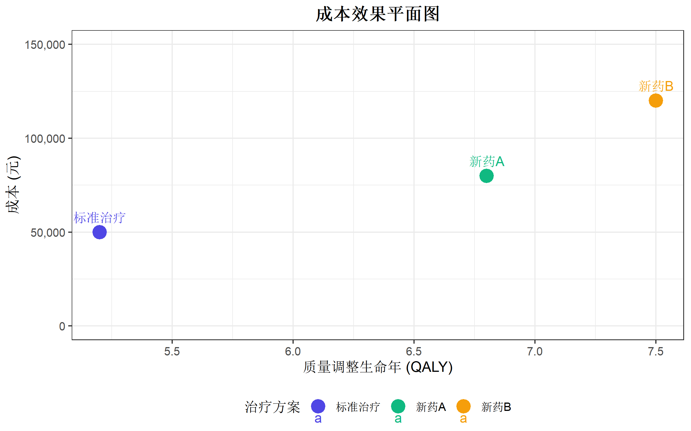
计算增量成本效果比 (ICER)
ICER 公式:\[ICER = \frac{\Delta Cost}{\Delta QALY} = \frac{Cost_B - Cost_A}{QALY_B - QALY_A}\]
# 以标准治疗为参照计算 ICER
reference <- cea_data[1, ]

icer_results <- cea_data |>
  mutate(
    Delta_Cost = Cost - reference$Cost,
    Delta_QALY = QALY - reference$QALY,
    ICER = ifelse(Delta_QALY > 0, Delta_Cost / Delta_QALY, NA)
  )

icer_results
Strategy Cost QALY Delta_Cost Delta_QALY ICER
1 标准治疗 50000 5.2 0 0.0 NA
2 新药A 80000 6.8 30000 1.6 18750.00
3 新药B 120000 7.5 70000 2.3 30434.78成本效果可接受曲线 (CEAC)
概率敏感性分析数据
模拟 1000 次蒙特卡洛模拟的结果:
set.seed(42)
n_sim <- 1000

# 模拟成本和效果的不确定性
sim_data <- data.frame(
  simulation = rep(1:n_sim, 3),
  Strategy = rep(c("标准治疗", "新药A", "新药B"), each = n_sim),
  Cost = c(
    rnorm(n_sim, 50000, 5000),
    rnorm(n_sim, 80000, 10000),
    rnorm(n_sim, 120000, 15000)
  ),
  QALY = c(
    rnorm(n_sim, 5.2, 0.5),
    rnorm(n_sim, 6.8, 0.6),
    rnorm(n_sim, 7.5, 0.7)
  )
)

head(sim_data)
simulation Strategy Cost QALY
1 1 标准治疗 56854.79 4.857169
2 2 标准治疗 47176.51 4.803643
3 3 标准治疗 51815.64 4.996498
4 4 标准治疗 53164.31 4.625665
5 5 标准治疗 52021.34 5.757880
6 6 标准治疗 49469.38 4.760272增量成本效果散点图
# 计算相对于标准治疗的增量
ref_data <- sim_data |>
  filter(Strategy == "标准治疗") |>
  select(simulation, ref_Cost = Cost, ref_QALY = QALY)

incremental_data <- sim_data |>
  filter(Strategy != "标准治疗") |>
  left_join(ref_data, by = "simulation") |>
  mutate(
    Delta_Cost = Cost - ref_Cost,
    Delta_QALY = QALY - ref_QALY
  )

# 绘制增量成本效果散点图
ggplot(incremental_data, aes(x = Delta_QALY, y = Delta_Cost, color = Strategy)) +
  geom_point(alpha = 0.3, size = 1.5) +
  geom_hline(yintercept = 0, linetype = "dashed", color = "gray50") +
  geom_vline(xintercept = 0, linetype = "dashed", color = "gray50") +
  # 添加 WTP 阈值线(假设 50000 元/QALY)
  geom_abline(intercept = 0, slope = 50000, linetype = "solid", color = "red", linewidth = 1) +
  scale_y_continuous(labels = comma_format()) +
  scale_color_manual(values = c("#10b981", "#f59e0b")) +
  labs(
    title = "增量成本效果散点图",
    subtitle = "红线: WTP 阈值 = 50,000 元/QALY",
    x = "增量 QALY (ΔQALYs)",
    y = "增量成本 (Δ成本)",
    color = "治疗方案"
  ) +
  theme_bw(base_size = 12) +
  theme(
    legend.position = "bottom",
    plot.title = element_text(hjust = 0.5, face = "bold")
  ) +
  annotate("text", x = 2.5, y = -20000, label = "优势象限\n(更有效且更便宜)",
           color = "darkgreen", size = 3) +
  annotate("text", x = -0.5, y = 80000, label = "劣势象限\n(更无效且更贵)",
           color = "darkred", size = 3)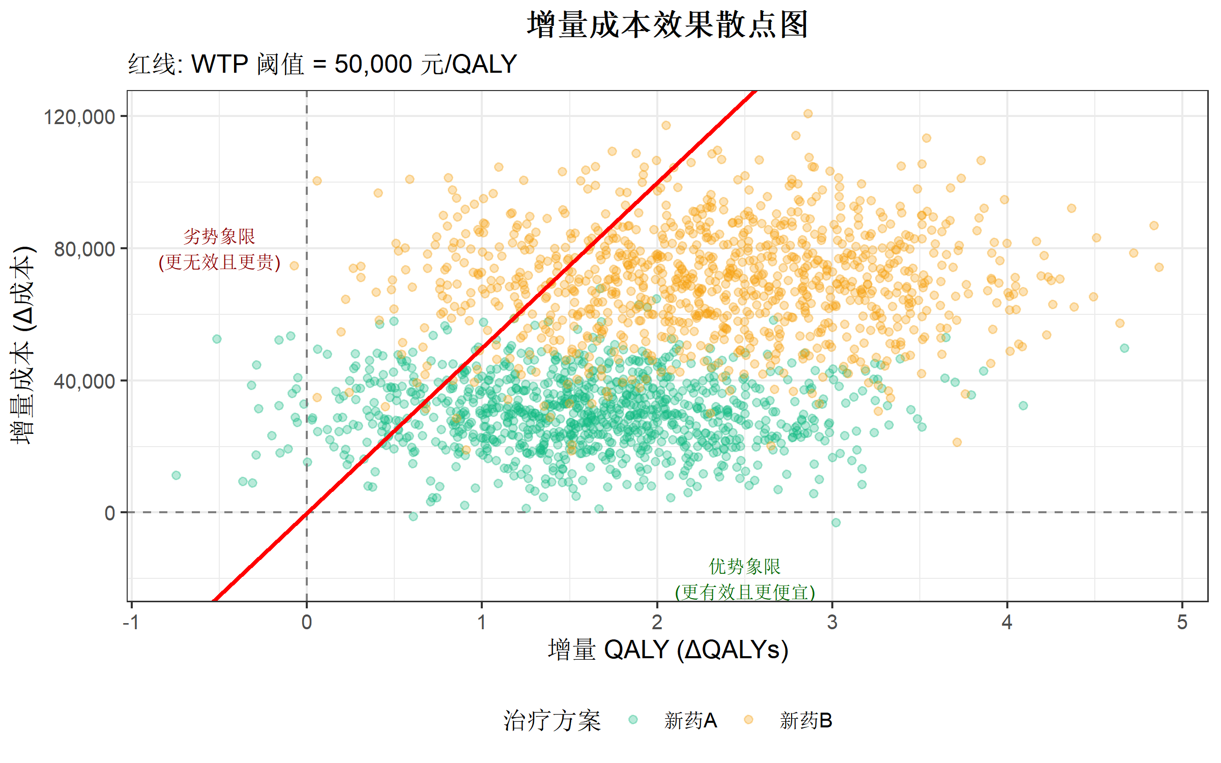
成本效果可接受曲线
CEAC 展示在不同 WTP 阈值下,每种策略具有成本效果的概率。
# 定义 WTP 范围
wtp_range <- seq(0, 150000, by = 5000)

# 计算每个 WTP 下各策略的可接受概率
calculate_ceac <- function(sim_data, wtp_range) {
  strategies <- unique(sim_data$Strategy)
  results <- data.frame()

  for (wtp in wtp_range) {
    # 计算每次模拟的净货币收益 (NMB)
    nmb_data <- sim_data |>
      mutate(NMB = wtp * QALY - Cost)

    # 找出每次模拟中 NMB 最高的策略
    best_strategy <- nmb_data |>
      group_by(simulation) |>
      slice_max(NMB, n = 1) |>
      ungroup()

    # 计算每种策略的最优概率
    prob_best <- best_strategy |>
      count(Strategy) |>
      mutate(Probability = n / n_sim)

    # 补充没有出现的策略
    for (s in strategies) {
      if (!s %in% prob_best$Strategy) {
        prob_best <- bind_rows(prob_best,
                               data.frame(Strategy = s, n = 0, Probability = 0))
      }
    }

    prob_best$WTP <- wtp
    results <- bind_rows(results, prob_best)
  }

  results
}

ceac_data <- calculate_ceac(sim_data, wtp_range)

# 绘制 CEAC
ggplot(ceac_data, aes(x = WTP, y = Probability, color = Strategy)) +
  geom_line(linewidth = 1.2) +
  geom_vline(xintercept = 50000, linetype = "dashed", color = "gray50") +
  scale_x_continuous(labels = comma_format()) +
  scale_y_continuous(limits = c(0, 1), labels = percent_format()) +
  scale_color_manual(values = c("#4f46e5", "#10b981", "#f59e0b")) +
  labs(
    title = "成本效果可接受曲线 (CEAC)",
    x = "支付意愿 (WTP, 元/QALY)",
    y = "成本效果的概率",
    color = "治疗方案"
  ) +
  theme_bw(base_size = 12) +
  theme(
    legend.position = "bottom",
    plot.title = element_text(hjust = 0.5, face = "bold")
  ) +
  annotate("text", x = 55000, y = 0.95, label = "WTP = 50,000",
           hjust = 0, color = "gray30", size = 3.5)
决策树模型
简单决策树示例
模拟一个简单的治疗决策场景:
# 决策树参数
params <- list(
  # 治疗成功率
  p_success_standard = 0.60,
  p_success_new = 0.80,

  # 成本
  c_standard = 10000,
  c_new = 25000,
  c_success = 5000,  # 成功后维护成本
  c_failure = 50000, # 失败后补救成本

  # 效用
  u_success = 0.9,
  u_failure = 0.5,

  # 时间范围(年)
  time_horizon = 5
)

# 计算期望成本和效果
calculate_expected <- function(p_success, c_treatment, params) {
  # 期望成本
  expected_cost <- c_treatment +
    p_success * params$c_success +
    (1 - p_success) * params$c_failure

  # 期望 QALY
  expected_qaly <- params$time_horizon * (
    p_success * params$u_success +
    (1 - p_success) * params$u_failure
  )

  list(cost = expected_cost, qaly = expected_qaly)
}

# 标准治疗
standard <- calculate_expected(params$p_success_standard, params$c_standard, params)

# 新治疗
new_treatment <- calculate_expected(params$p_success_new, params$c_new, params)

# 结果汇总
decision_tree_results <- data.frame(
  Strategy = c("标准治疗", "新治疗"),
  Expected_Cost = c(standard$cost, new_treatment$cost),
  Expected_QALY = c(standard$qaly, new_treatment$qaly)
) |>
  mutate(
    ICER = c(NA, (Expected_Cost[2] - Expected_Cost[1]) /
               (Expected_QALY[2] - Expected_QALY[1]))
  )

decision_tree_results
Strategy Expected_Cost Expected_QALY ICER
1 标准治疗 33000 3.7 NA
2 新治疗 39000 4.1 15000决策树可视化
# 创建决策树数据
tree_data <- data.frame(
  x = c(0, 1, 1, 2, 2, 2, 2),
  y = c(3, 4.5, 1.5, 5.5, 3.5, 2.5, 0.5),
  label = c(
    "决策节点",
    "标准治疗",
    "新治疗",
    paste0("成功 (", params$p_success_standard * 100, "%)"),
    paste0("失败 (", (1 - params$p_success_standard) * 100, "%)"),
    paste0("成功 (", params$p_success_new * 100, "%)"),
    paste0("失败 (", (1 - params$p_success_new) * 100, "%)")
  ),
  node_type = c("decision", "chance", "chance", "outcome", "outcome", "outcome", "outcome")
)

# 连接线数据
edges <- data.frame(
  x = c(0, 0, 1, 1, 1, 1),
  xend = c(1, 1, 2, 2, 2, 2),
  y = c(3, 3, 4.5, 4.5, 1.5, 1.5),
  yend = c(4.5, 1.5, 5.5, 3.5, 2.5, 0.5)
)

ggplot() +
  # 绘制连接线
  geom_segment(data = edges,
               aes(x = x, y = y, xend = xend, yend = yend),
               color = "gray50", linewidth = 0.8) +
  # 决策节点(方形)
  geom_point(data = tree_data |> filter(node_type == "decision"),
             aes(x = x, y = y), shape = 15, size = 8, color = "#4f46e5") +
  # 机会节点(圆形)
  geom_point(data = tree_data |> filter(node_type == "chance"),
             aes(x = x, y = y), shape = 16, size = 6, color = "#10b981") +
  # 结果节点(三角形)
  geom_point(data = tree_data |> filter(node_type == "outcome"),
             aes(x = x, y = y), shape = 17, size = 5, color = "#f59e0b") +
  # 标签
  geom_text(data = tree_data,
            aes(x = x, y = y, label = label),
            hjust = -0.1, vjust = 0.5, size = 3.5) +
  # 添加结果数值
  annotate("text", x = 2.8, y = 5.5,
           label = paste0("成本: ", comma(params$c_standard + params$c_success),
                          "\nQALY: ", params$time_horizon * params$u_success),
           hjust = 0, size = 3, color = "gray30") +
  annotate("text", x = 2.8, y = 3.5,
           label = paste0("成本: ", comma(params$c_standard + params$c_failure),
                          "\nQALY: ", params$time_horizon * params$u_failure),
           hjust = 0, size = 3, color = "gray30") +
  annotate("text", x = 2.8, y = 2.5,
           label = paste0("成本: ", comma(params$c_new + params$c_success),
                          "\nQALY: ", params$time_horizon * params$u_success),
           hjust = 0, size = 3, color = "gray30") +
  annotate("text", x = 2.8, y = 0.5,
           label = paste0("成本: ", comma(params$c_new + params$c_failure),
                          "\nQALY: ", params$time_horizon * params$u_failure),
           hjust = 0, size = 3, color = "gray30") +
  labs(title = "治疗决策树模型") +
  theme_void() +
  theme(plot.title = element_text(hjust = 0.5, face = "bold", size = 14)) +
  xlim(-0.5, 4) +
  ylim(-0.5, 6.5)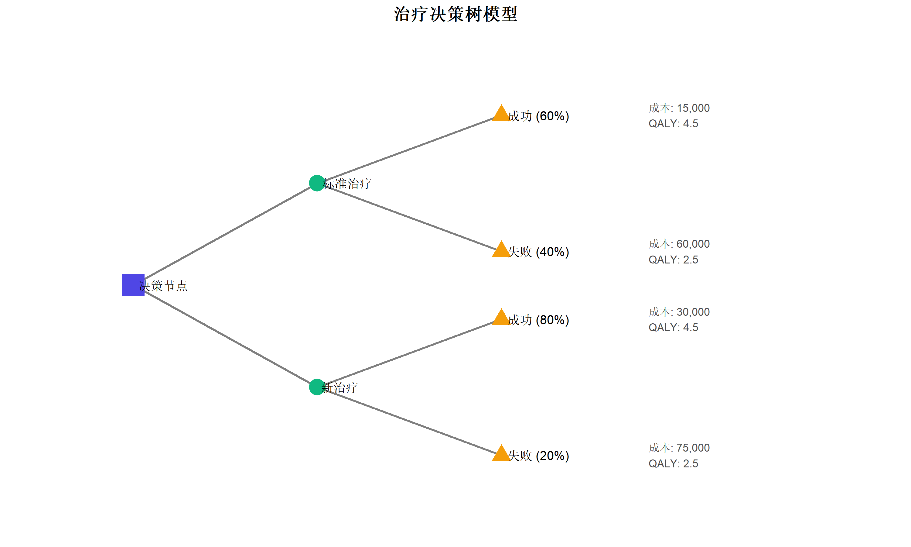
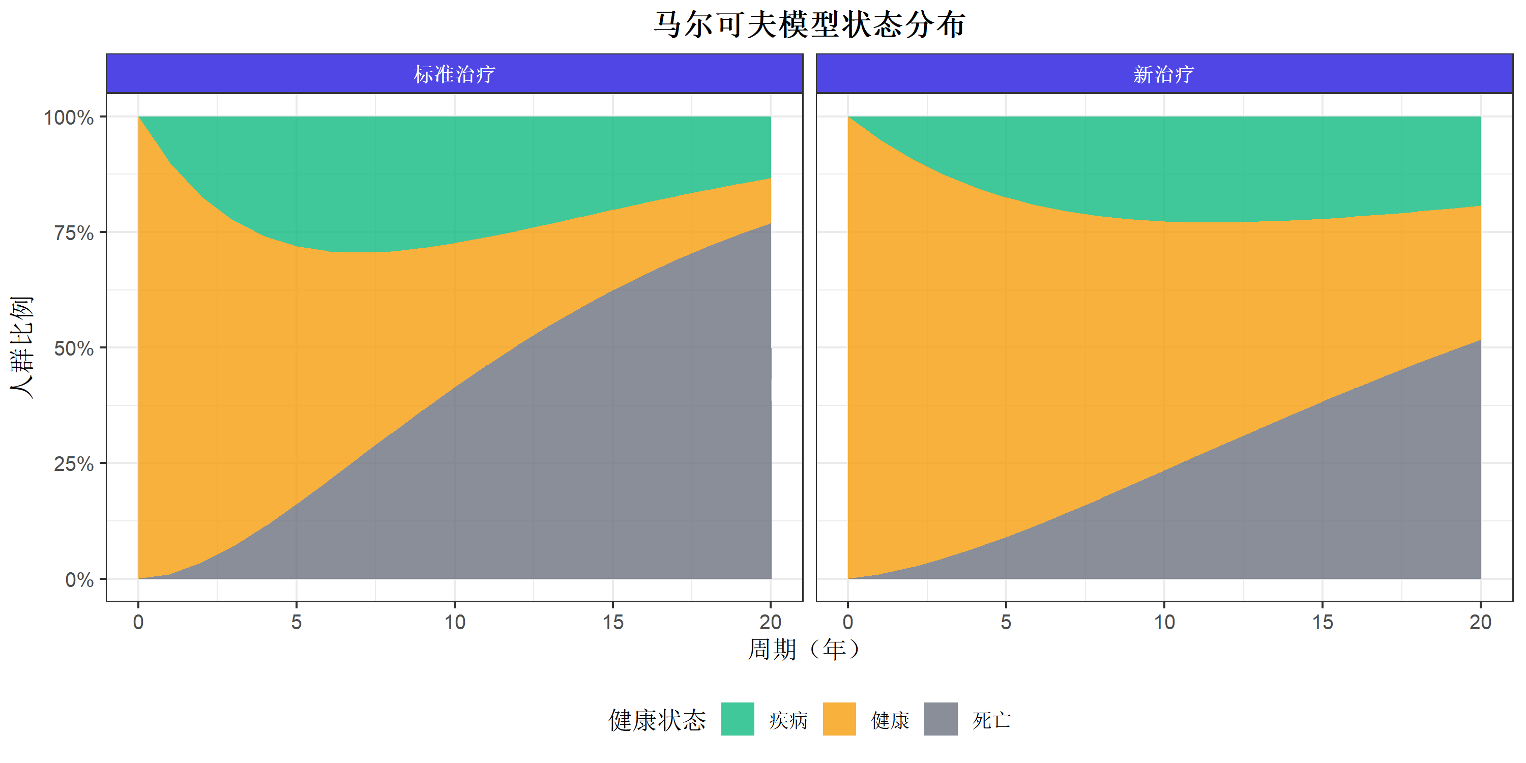
马尔可夫模型
模型概述
马尔可夫模型是卫生经济学中最常用的建模方法,用于模拟疾病进展和干预效果。
# 定义模型参数
markov_params <- list(
  # 状态名称
  states = c("健康", "疾病", "死亡"),
  n_states = 3,

  # 周期数(年)
  n_cycles = 20,

  # 转移概率(标准治疗)
  p_healthy_disease_std = 0.10,
  p_disease_death_std = 0.15,

  # 转移概率(新治疗)
  p_healthy_disease_new = 0.05,
  p_disease_death_new = 0.10,

  # 成本(每周期)
  c_healthy = 1000,
  c_disease = 8000,
  c_death = 0,
  c_new_treatment = 5000,  # 新治疗额外成本

  # 效用
  u_healthy = 1.0,
  u_disease = 0.6,
  u_death = 0,

  # 贴现率
  discount_rate = 0.03
)
构建转移概率矩阵
# 标准治疗转移矩阵
trans_matrix_std <- matrix(c(
  0.89, 0.10, 0.01,  # 从健康状态
  0.00, 0.84, 0.16,  # 从疾病状态(含背景死亡)
  0.00, 0.00, 1.00   # 从死亡状态
), nrow = 3, byrow = TRUE)

rownames(trans_matrix_std) <- colnames(trans_matrix_std) <- markov_params$states

# 新治疗转移矩阵
trans_matrix_new <- matrix(c(
  0.94, 0.05, 0.01,  # 从健康状态
  0.00, 0.89, 0.11,  # 从疾病状态
  0.00, 0.00, 1.00   # 从死亡状态
), nrow = 3, byrow = TRUE)

rownames(trans_matrix_new) <- colnames(trans_matrix_new) <- markov_params$states

trans_matrix_std
健康 疾病 死亡
健康 0.89 0.10 0.01
疾病 0.00 0.84 0.16
死亡 0.00 0.00 1.00运行马尔可夫模拟
# 马尔可夫模拟函数
run_markov <- function(trans_matrix, params, treatment_cost = 0) {
  n_cycles <- params$n_cycles
  states <- params$states

  # 初始状态分布(100% 健康)
  state_dist <- matrix(0, nrow = n_cycles + 1, ncol = 3)
  colnames(state_dist) <- states
  state_dist[1, ] <- c(1, 0, 0)

  # 成本和效用向量
  costs <- c(params$c_healthy, params$c_disease, params$c_death)
  utilities <- c(params$u_healthy, params$u_disease, params$u_death)

  # 贴现因子
  discount_factors <- (1 / (1 + params$discount_rate)) ^ (0:n_cycles)

  # 模拟各周期
  for (i in 1:n_cycles) {
    state_dist[i + 1, ] <- state_dist[i, ] %*% trans_matrix
  }

  # 计算成本和 QALY
  cycle_costs <- state_dist %*% costs + treatment_cost
  cycle_qalys <- state_dist %*% utilities

  # 贴现后总计
  total_cost <- sum(cycle_costs * discount_factors)
  total_qaly <- sum(cycle_qalys * discount_factors)

  list(
    state_dist = state_dist,
    total_cost = total_cost,
    total_qaly = total_qaly,
    cycle_costs = cycle_costs,
    cycle_qalys = cycle_qalys
  )
}

# 运行两种治疗方案
results_std <- run_markov(trans_matrix_std, markov_params, treatment_cost = 0)
results_new <- run_markov(trans_matrix_new, markov_params, treatment_cost = markov_params$c_new_treatment)
状态分布可视化
# 整理状态分布数据
prepare_state_data <- function(results, treatment_name) {
  data.frame(
    Cycle = rep(0:markov_params$n_cycles, 3),
    State = rep(markov_params$states, each = markov_params$n_cycles + 1),
    Proportion = as.vector(results$state_dist),
    Treatment = treatment_name
  )
}

state_data <- bind_rows(
  prepare_state_data(results_std, "标准治疗"),
  prepare_state_data(results_new, "新治疗")
)

# 绘制状态转移图
ggplot(state_data, aes(x = Cycle, y = Proportion, fill = State)) +
  geom_area(alpha = 0.8) +
  facet_wrap(~Treatment) +
  scale_fill_manual(values = c("#10b981", "#f59e0b", "#6b7280")) +
  scale_y_continuous(labels = percent_format()) +
  labs(
    title = "马尔可夫模型状态分布",
    x = "周期(年)",
    y = "人群比例",
    fill = "健康状态"
  ) +
  theme_bw(base_size = 12) +
  theme(
    legend.position = "bottom",
    plot.title = element_text(hjust = 0.5, face = "bold"),
    strip.background = element_rect(fill = "#4f46e5"),
    strip.text = element_text(color = "white", face = "bold")
  )
马尔可夫模型结果汇总
# 汇总结果
markov_summary <- data.frame(
  Strategy = c("标准治疗", "新治疗"),
  Total_Cost = c(results_std$total_cost, results_new$total_cost),
  Total_QALY = c(results_std$total_qaly, results_new$total_qaly)
) |>
  mutate(
    Delta_Cost = Total_Cost - Total_Cost[1],
    Delta_QALY = Total_QALY - Total_QALY[1],
    ICER = ifelse(Delta_QALY > 0, Delta_Cost / Delta_QALY, NA)
  )

markov_summary
Strategy Total_Cost Total_QALY Delta_Cost Delta_QALY ICER
1 标准治疗 33714.77 9.017402 0.00 0.000000 NA
2 新治疗 111169.34 11.417944 77454.57 2.400542 32265.45单因素敏感性分析
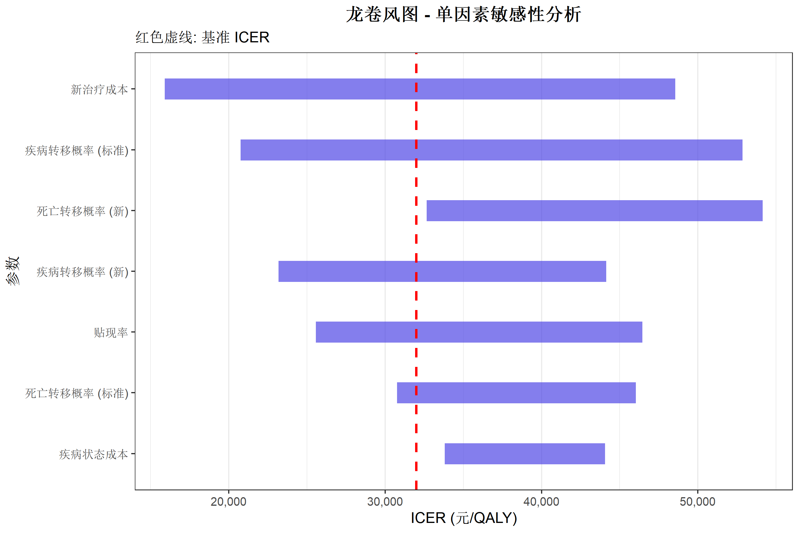
龙卷风图
龙卷风图展示各参数对结果的影响程度。
# 定义参数范围
sensitivity_params <- data.frame(
  Parameter = c(
    "疾病转移概率 (标准)",
    "死亡转移概率 (标准)",
    "疾病转移概率 (新)",
    "死亡转移概率 (新)",
    "疾病状态成本",
    "新治疗成本",
    "贴现率"
  ),
  Base = c(0.10, 0.15, 0.05, 0.10, 8000, 5000, 0.03),
  Low = c(0.05, 0.10, 0.03, 0.05, 5000, 3000, 0.00),
  High = c(0.15, 0.20, 0.08, 0.15, 12000, 8000, 0.05)
)

# 模拟敏感性分析结果(简化演示)
set.seed(123)
tornado_data <- sensitivity_params |>
  mutate(
    ICER_low = runif(n(), 15000, 35000),
    ICER_high = runif(n(), 35000, 55000),
    ICER_base = 32000
  ) |>
  arrange(desc(abs(ICER_high - ICER_low)))

# 绘制龙卷风图
ggplot(tornado_data) +
  geom_segment(aes(y = reorder(Parameter, abs(ICER_high - ICER_low)),
                   yend = reorder(Parameter, abs(ICER_high - ICER_low)),
                   x = ICER_low, xend = ICER_high),
               linewidth = 8, color = "#4f46e5", alpha = 0.7) +
  geom_vline(xintercept = tornado_data$ICER_base[1],
             linetype = "dashed", color = "red", linewidth = 1) +
  scale_x_continuous(labels = comma_format()) +
  labs(
    title = "龙卷风图 - 单因素敏感性分析",
    subtitle = "红色虚线: 基准 ICER",
    x = "ICER (元/QALY)",
    y = "参数"
  ) +
  theme_bw(base_size = 12) +
  theme(
    plot.title = element_text(hjust = 0.5, face = "bold"),
    panel.grid.major.y = element_blank()
  )
成本效果前沿
效率前沿线
效率前沿展示在给定成本下可达到的最大效果。
# 创建多策略数据
frontier_data <- data.frame(
  Strategy = c("无干预", "方案A", "方案B", "方案C", "方案D", "方案E"),
  Cost = c(10000, 30000, 45000, 60000, 90000, 100000),
  QALY = c(4.0, 5.5, 6.2, 6.8, 7.8, 7.9)
)

# 识别效率前沿上的策略(简化算法)
frontier_data <- frontier_data |>
  arrange(Cost) |>
  mutate(
    on_frontier = c(TRUE, TRUE, TRUE, FALSE, TRUE, FALSE)  # 手动标记
  )

ggplot(frontier_data, aes(x = QALY, y = Cost)) +
  # 绘制效率前沿线
  geom_line(data = frontier_data |> filter(on_frontier),
            color = "#4f46e5", linewidth = 1.2) +
  # 所有点
  geom_point(aes(color = on_frontier), size = 5) +
  # 标签
  geom_text(aes(label = Strategy), vjust = -1, size = 3.5) +
  scale_color_manual(values = c("TRUE" = "#10b981", "FALSE" = "#ef4444"),
                     labels = c("TRUE" = "效率前沿", "FALSE" = "被支配")) +
  scale_y_continuous(labels = comma_format()) +
  labs(
    title = "成本效果效率前沿",
    x = "质量调整生命年 (QALY)",
    y = "成本 (元)",
    color = "策略状态"
  ) +
  theme_bw(base_size = 12) +
  theme(
    legend.position = "bottom",
    plot.title = element_text(hjust = 0.5, face = "bold")
  )
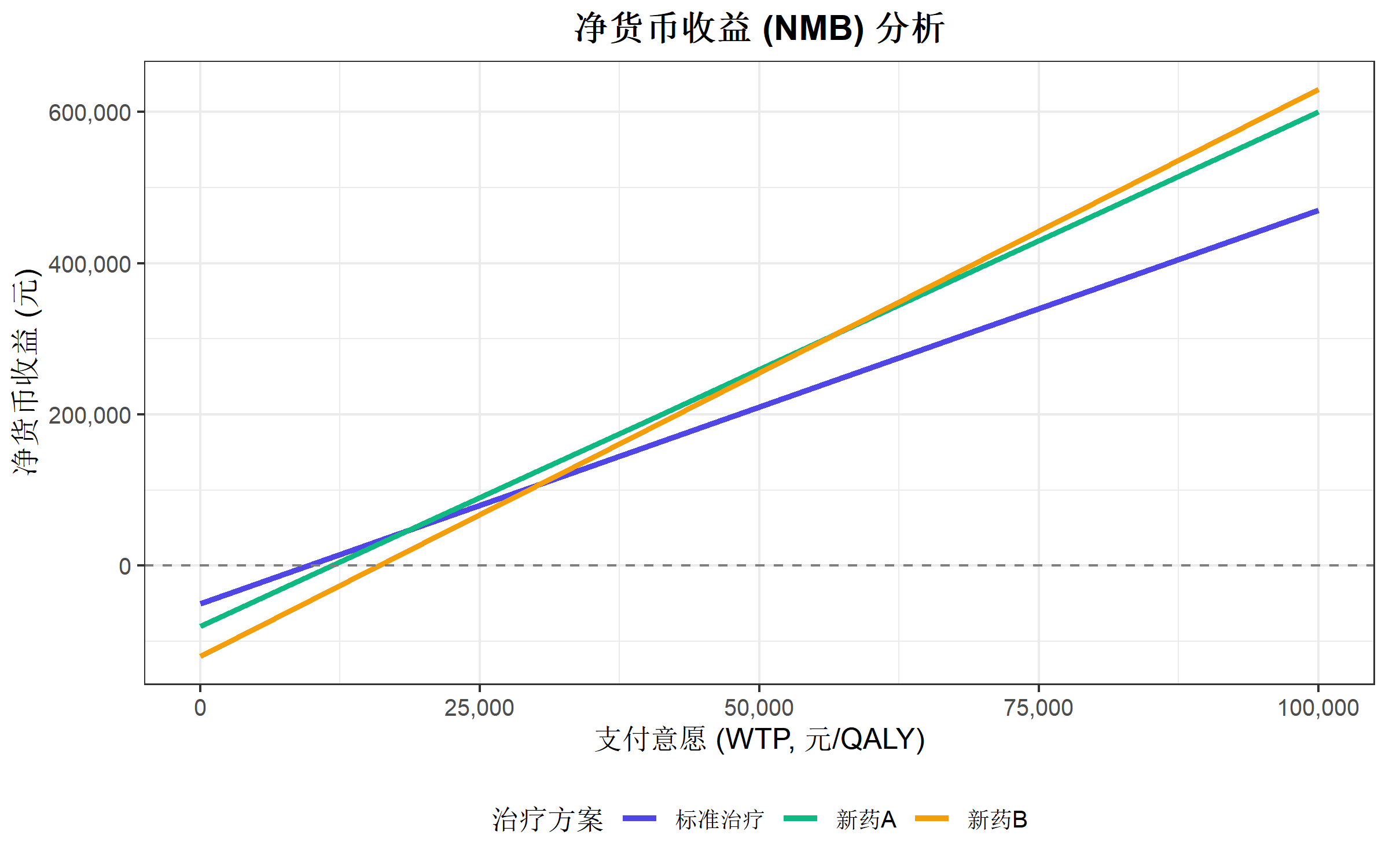
净货币收益分析
NMB 计算与可视化
净货币收益(Net Monetary Benefit):\[NMB = WTP \times \Delta QALY - \Delta Cost\]
# 计算不同 WTP 下的 NMB
wtp_values <- seq(0, 100000, by = 10000)

nmb_data <- expand.grid(
  WTP = wtp_values,
  Strategy = c("标准治疗", "新药A", "新药B")
) |>
  left_join(cea_data, by = "Strategy") |>
  mutate(
    NMB = WTP * QALY - Cost
  )

ggplot(nmb_data, aes(x = WTP, y = NMB, color = Strategy)) +
  geom_line(linewidth = 1.2) +
  geom_hline(yintercept = 0, linetype = "dashed", color = "gray50") +
  scale_x_continuous(labels = comma_format()) +
  scale_y_continuous(labels = comma_format()) +
  scale_color_manual(values = c("#4f46e5", "#10b981", "#f59e0b")) +
  labs(
    title = "净货币收益 (NMB) 分析",
    x = "支付意愿 (WTP, 元/QALY)",
    y = "净货币收益 (元)",
    color = "治疗方案"
  ) +
  theme_bw(base_size = 12) +
  theme(
    legend.position = "bottom",
    plot.title = element_text(hjust = 0.5, face = "bold")
  )
实用函数封装
ICER 计算函数
#' 计算 ICER
#' @param cost_new 新治疗成本
#' @param cost_ref 参照治疗成本
#' @param effect_new 新治疗效果
#' @param effect_ref 参照治疗效果
#' @return ICER 值
calculate_icer <- function(cost_new, cost_ref, effect_new, effect_ref) {
  delta_cost <- cost_new - cost_ref
  delta_effect <- effect_new - effect_ref

  if (delta_effect <= 0) {
    warning("增量效果 <= 0,新治疗可能被支配")
    return(NA)
  }

  icer <- delta_cost / delta_effect

  cat("增量成本:", comma(delta_cost), "元\n")
  cat("增量效果:", round(delta_effect, 3), "QALY\n")
  cat("ICER:", comma(round(icer, 0)), "元/QALY\n")

  invisible(icer)
}

# 示例
calculate_icer(
  cost_new = 80000, cost_ref = 50000,
  effect_new = 6.8, effect_ref = 5.2
)
增量成本: 30,000 元
增量效果: 1.6 QALY
ICER: 18,750 元/QALY总结
卫生经济学评价是医疗决策的重要工具,R 语言提供了强大的分析能力:
| 分析类型 | 关键指标 | 推荐方法 |
|---|---|---|
| 成本效果分析 | ICER | 增量分析、效率前沿 |
| 不确定性分析 | CEAC、龙卷风图 | 概率敏感性分析 |
| 疾病建模 | 状态分布、生存曲线 | 马尔可夫模型、决策树 |
| 决策支持 | NMB | 净货币收益分析 |
推荐学习资源
- DARTH 工作组 - 决策分析建模教程
- ISPOR 指南 - 卫生经济学方法学标准
- R for Health Technology Assessment - R 语言 HTA 资源
常用 WTP 阈值参考
| 国家/地区 | WTP 阈值(每 QALY) |
|---|---|
| 中国 | 1-3 倍人均 GDP(约 7-21 万元) |
| 英国 (NICE) | £20,000-30,000 |
| 美国 | $50,000-150,000 |
| WHO 推荐 | 1-3 倍人均 GDP |