library(ggplot2)
library(dplyr)
library(tidyr)双坐标轴:左右两个 Y 轴的绑图技巧
可视化
ggplot2
双坐标轴
双坐标轴(Dual Y-Axis)图表可以在同一张图中展示两个量纲不同的变量,常用于展示趋势对比、柱线混合图等场景。本教程介绍如何在 ggplot2 中实现双坐标轴绑图。
什么是双坐标轴?
双坐标轴图表是指在同一张图中使用两个 Y 轴:
- 左 Y 轴(主轴):通常展示主要变量
- 右 Y 轴(次轴):展示次要变量,量纲可能不同
适用场景
| 场景 | 示例 |
|---|---|
| 柱线混合图 | 柱状图显示销量,折线图显示增长率 |
| 趋势对比 | 温度与降雨量的时间变化 |
| 因果关系 | 广告投入与销售额的关系 |
争议与注意事项
双坐标轴图表存在一些争议:
- 误导性:两个 Y 轴的刻度比例会影响读者对数据关系的理解
- 可读性:增加了图表的复杂度
- 替代方案:分面图(facet)通常是更好的选择
使用建议:
- ✅ 两个变量确实有关联时使用
- ✅ 明确标注两个轴的单位
- ❌ 避免刻意调整刻度来制造相关性假象
基础用法
ggplot2 中的 sec_axis()
ggplot2 通过 sec_axis() 函数实现双坐标轴。核心原理是 次轴必须是主轴的线性变换。
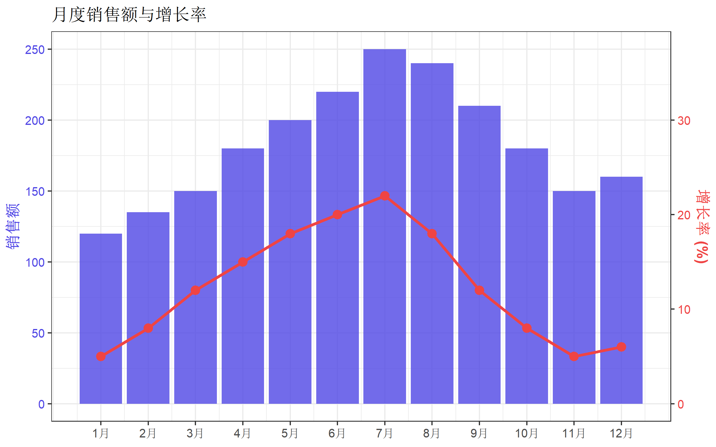
最简示例
# 创建示例数据
df <- data.frame(
  month = 1:12,
  sales = c(120, 135, 150, 180, 200, 220, 250, 240, 210, 180, 150, 160),
  growth_rate = c(5, 8, 12, 15, 18, 20, 22, 18, 12, 8, 5, 6)
)

# 定义转换系数(让两个变量在图上有相似的范围)
coef <- max(df$sales) / max(df$growth_rate)

ggplot(df, aes(x = month)) +
  geom_col(aes(y = sales), fill = "#4f46e5", alpha = 0.7) +
  geom_line(aes(y = growth_rate * coef), color = "#ef4444", linewidth = 1.2) +
  geom_point(aes(y = growth_rate * coef), color = "#ef4444", size = 3) +
  scale_y_continuous(
    name = "销售额",
    sec.axis = sec_axis(~ . / coef, name = "增长率 (%)")
  ) +
  scale_x_continuous(breaks = 1:12, labels = paste0(1:12, "月")) +
  labs(title = "月度销售额与增长率", x = NULL) +
  theme_bw(base_size = 12)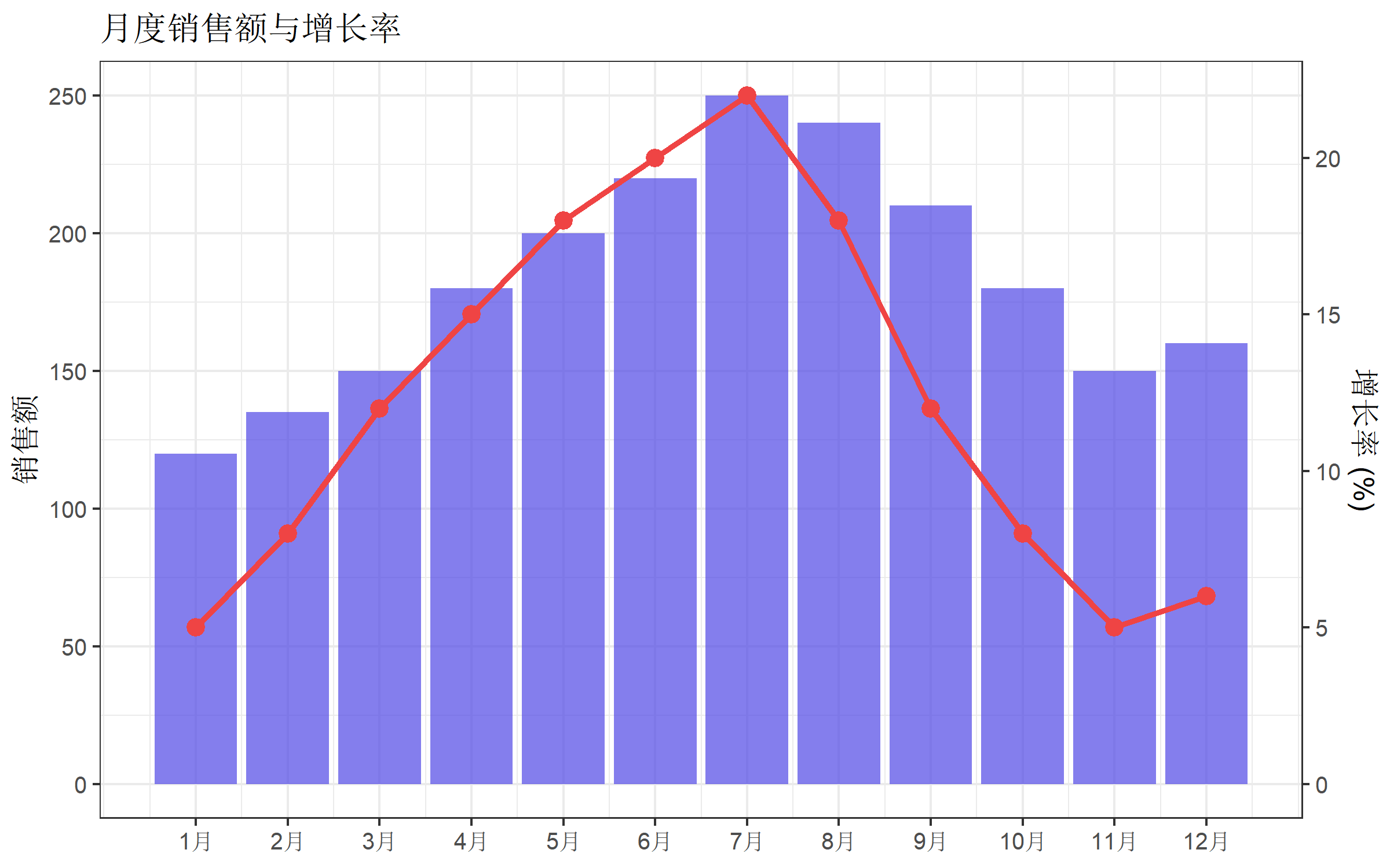
关键步骤解析
- 计算转换系数:
coef <- max(主轴变量) / max(次轴变量) - 绑制次轴数据时乘以系数:
aes(y = growth_rate * coef) - 设置 sec_axis 时除以系数:
sec_axis(~ . / coef, name = "次轴标签")
柱线混合图
柱线混合图是双坐标轴最常见的应用场景。
基础版本
# 模拟季度数据
quarterly <- data.frame(
  quarter = c("Q1", "Q2", "Q3", "Q4"),
  revenue = c(450, 520, 680, 720),
  profit_margin = c(12, 15, 18, 20)
)

coef <- max(quarterly$revenue) / max(quarterly$profit_margin)

ggplot(quarterly, aes(x = quarter)) +
  geom_col(aes(y = revenue), fill = "#0ea5e9", width = 0.6) +
  geom_line(aes(y = profit_margin * coef, group = 1),
            color = "#f97316", linewidth = 1.5) +
  geom_point(aes(y = profit_margin * coef),
             color = "#f97316", size = 4) +
  scale_y_continuous(
    name = "营收 (万元)",
    sec.axis = sec_axis(~ . / coef, name = "利润率 (%)")
  ) +
  labs(title = "季度营收与利润率", x = NULL) +
  theme_minimal(base_size = 12)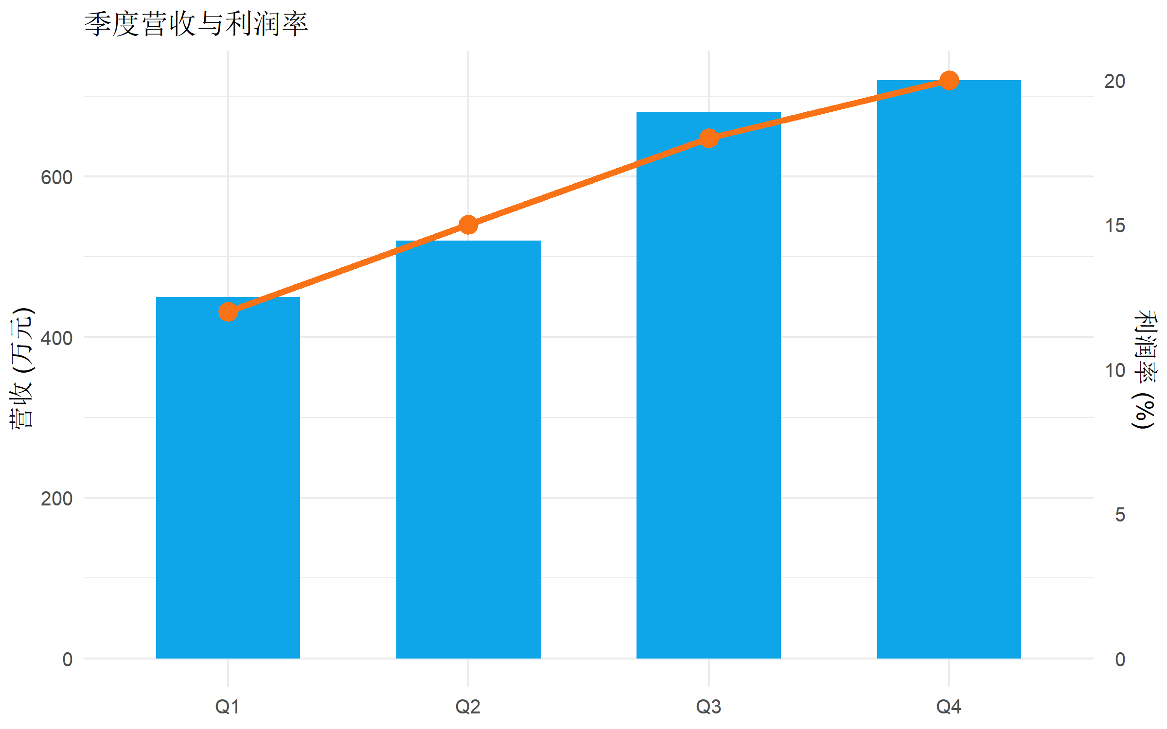
添加数据标签
ggplot(quarterly, aes(x = quarter)) +
  geom_col(aes(y = revenue), fill = "#0ea5e9", width = 0.6) +
  geom_text(aes(y = revenue, label = revenue), vjust = -0.5, size = 4) +
  geom_line(aes(y = profit_margin * coef, group = 1),
            color = "#f97316", linewidth = 1.5) +
  geom_point(aes(y = profit_margin * coef),
             color = "#f97316", size = 4) +
  geom_text(aes(y = profit_margin * coef, label = paste0(profit_margin, "%")),
            vjust = -1, color = "#f97316", size = 4) +
  scale_y_continuous(
    name = "营收 (万元)",
    limits = c(0, max(quarterly$revenue) * 1.15),
    sec.axis = sec_axis(~ . / coef, name = "利润率 (%)")
  ) +
  labs(title = "季度营收与利润率", x = NULL) +
  theme_minimal(base_size = 12)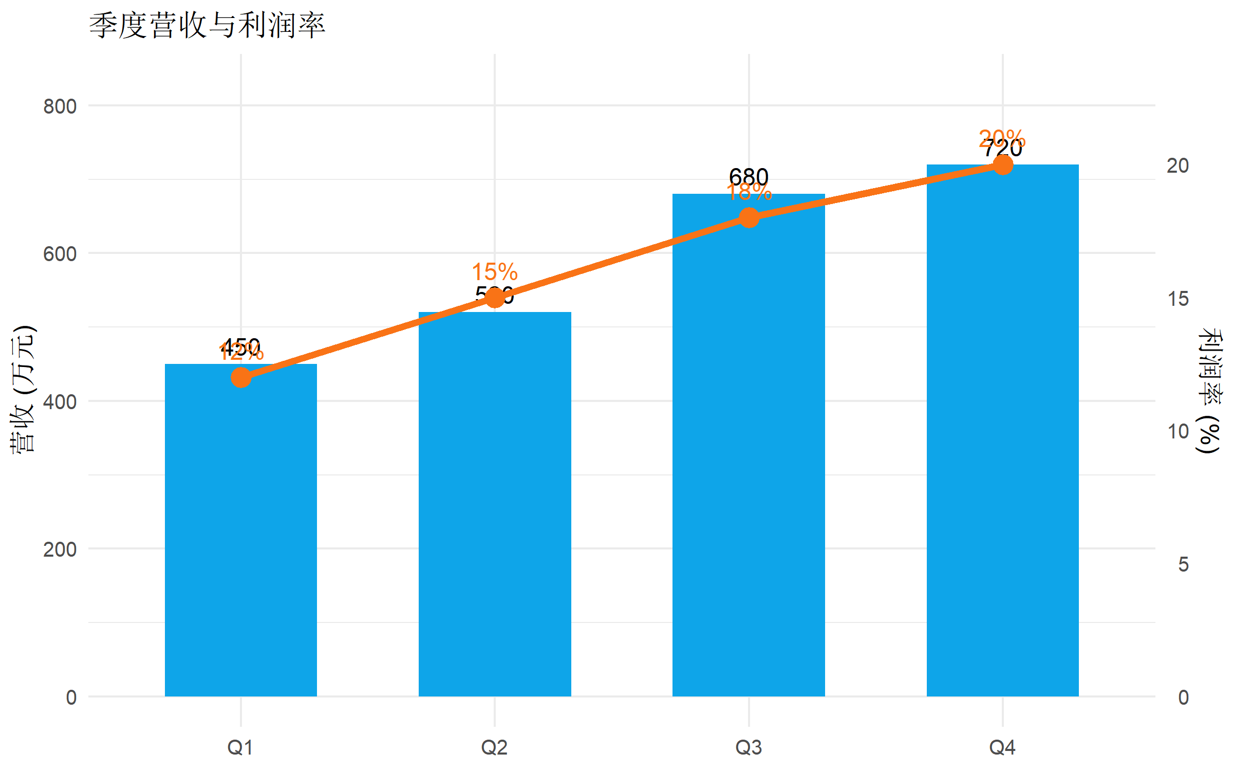
双折线图
当两个变量都是连续时间序列时,可以用双折线图。
# 模拟气象数据
weather <- data.frame(
  date = seq(as.Date("2025-01-01"), as.Date("2025-12-01"), by = "month"),
  temperature = c(8, 10, 15, 20, 25, 30, 33, 32, 28, 22, 15, 10),
  rainfall = c(45, 60, 80, 120, 180, 220, 150, 100, 70, 50, 40, 35)
)

coef <- max(weather$rainfall) / max(weather$temperature)

ggplot(weather, aes(x = date)) +
  geom_line(aes(y = temperature), color = "#ef4444", linewidth = 1.2) +
  geom_point(aes(y = temperature), color = "#ef4444", size = 2.5) +
  geom_area(aes(y = rainfall / coef), fill = "#3b82f6", alpha = 0.3) +
  geom_line(aes(y = rainfall / coef), color = "#3b82f6", linewidth = 1.2) +
  scale_y_continuous(
    name = "温度 (°C)",
    sec.axis = sec_axis(~ . * coef, name = "降雨量 (mm)")
  ) +
  scale_x_date(date_labels = "%m月", date_breaks = "1 month") +
  labs(title = "2025 年月度温度与降雨量", x = NULL) +
  theme_bw(base_size = 12) +
  theme(axis.text.x = element_text(angle = 45, hjust = 1))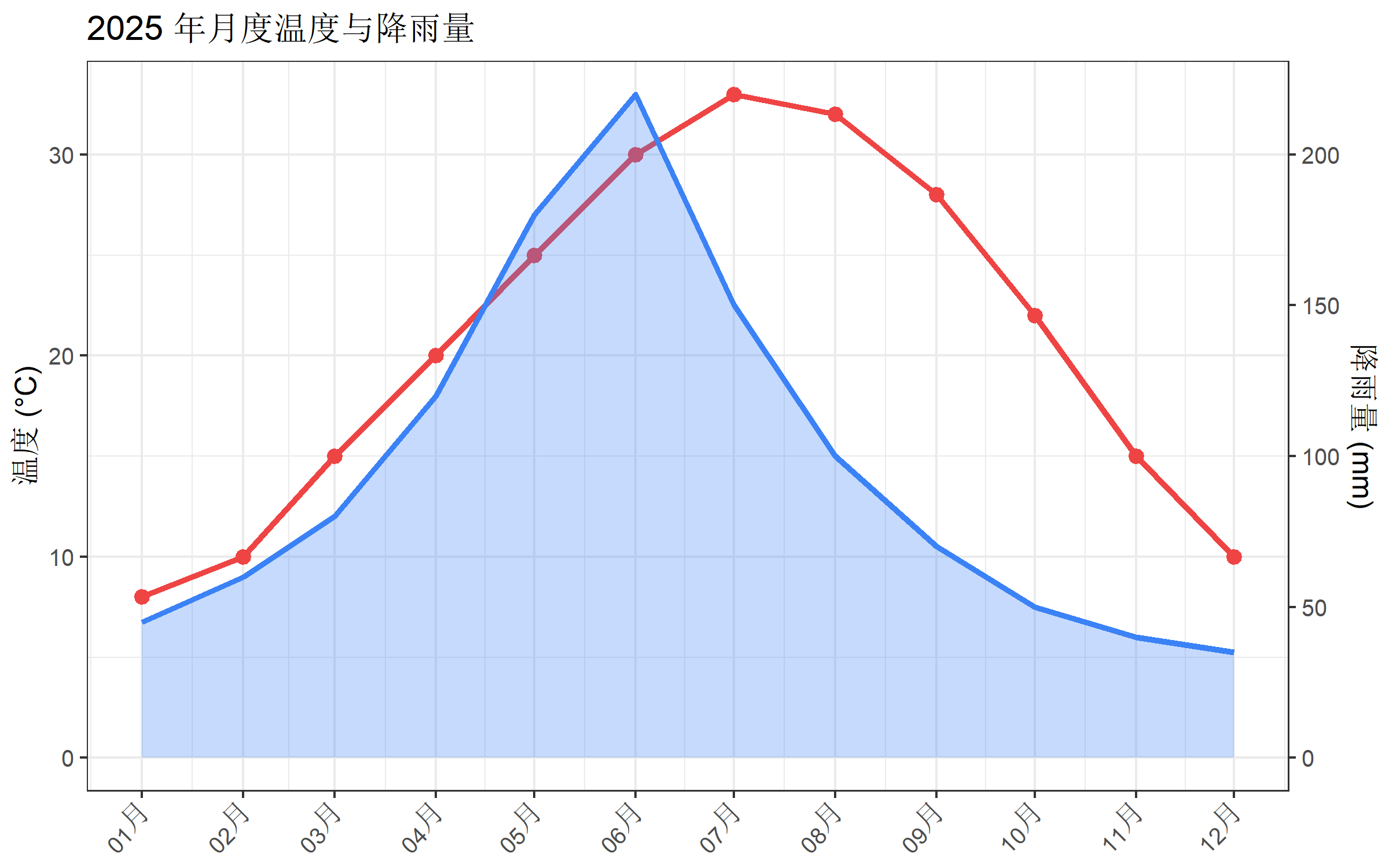
自定义坐标轴样式
匹配颜色
让坐标轴颜色与对应的数据系列颜色一致,提高可读性:
ggplot(df, aes(x = month)) +
  geom_col(aes(y = sales), fill = "#4f46e5", alpha = 0.8) +
  geom_line(aes(y = growth_rate * coef), color = "#ef4444", linewidth = 1.2) +
  geom_point(aes(y = growth_rate * coef), color = "#ef4444", size = 3) +
  scale_y_continuous(
    name = "销售额",
    sec.axis = sec_axis(~ . / coef, name = "增长率 (%)")
  ) +
  scale_x_continuous(breaks = 1:12, labels = paste0(1:12, "月")) +
  labs(title = "月度销售额与增长率", x = NULL) +
  theme_bw(base_size = 12) +
  theme(
    axis.title.y.left = element_text(color = "#4f46e5", face = "bold"),
    axis.text.y.left = element_text(color = "#4f46e5"),
    axis.title.y.right = element_text(color = "#ef4444", face = "bold"),
    axis.text.y.right = element_text(color = "#ef4444")
  )
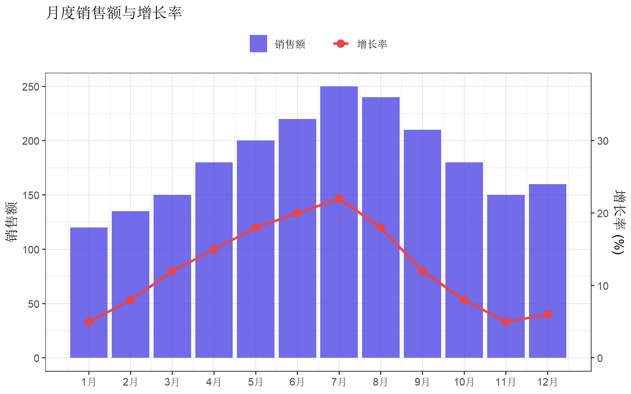
添加图例
双坐标轴图表默认没有图例,需要手动创建:
ggplot(df, aes(x = month)) +
  geom_col(aes(y = sales, fill = "销售额"), alpha = 0.8) +
  geom_line(aes(y = growth_rate * coef, color = "增长率"), linewidth = 1.2) +
  geom_point(aes(y = growth_rate * coef, color = "增长率"), size = 3) +
  scale_fill_manual(values = c("销售额" = "#4f46e5")) +
  scale_color_manual(values = c("增长率" = "#ef4444")) +
  scale_y_continuous(
    name = "销售额",
    sec.axis = sec_axis(~ . / coef, name = "增长率 (%)")
  ) +
  scale_x_continuous(breaks = 1:12, labels = paste0(1:12, "月")) +
  labs(
    title = "月度销售额与增长率",
    x = NULL,
    fill = NULL,
    color = NULL
  ) +
  theme_bw(base_size = 12) +
  theme(
    legend.position = "top",
    legend.box = "horizontal"
  ) +
  guides(
    fill = guide_legend(order = 1),
    color = guide_legend(order = 2)
  )
分组双坐标轴
当有分组变量时,可以使用堆叠或分组柱状图。
# 分组数据
grouped_data <- data.frame(
  quarter = rep(c("Q1", "Q2", "Q3", "Q4"), each = 2),
  category = rep(c("产品A", "产品B"), 4),
  sales = c(200, 150, 250, 180, 300, 220, 280, 250),
  total_growth = rep(c(8, 12, 15, 10), each = 2)
)

# 计算每季度总销售额用于绑图
grouped_summary <- grouped_data |>
  group_by(quarter) |>
  summarise(total_sales = sum(sales), growth = first(total_growth))

coef <- max(grouped_summary$total_sales) / max(grouped_summary$growth)

ggplot() +
  geom_col(data = grouped_data,
           aes(x = quarter, y = sales, fill = category),
           position = "dodge", width = 0.7) +
  geom_line(data = grouped_summary,
            aes(x = quarter, y = growth * coef, group = 1),
            color = "#f97316", linewidth = 1.5) +
  geom_point(data = grouped_summary,
             aes(x = quarter, y = growth * coef),
             color = "#f97316", size = 4) +
  scale_fill_manual(values = c("产品A" = "#4f46e5", "产品B" = "#06b6d4")) +
  scale_y_continuous(
    name = "销售额 (万元)",
    sec.axis = sec_axis(~ . / coef, name = "增长率 (%)")
  ) +
  labs(title = "分产品销售额与总体增长率", x = NULL, fill = NULL) +
  theme_minimal(base_size = 12) +
  theme(legend.position = "top")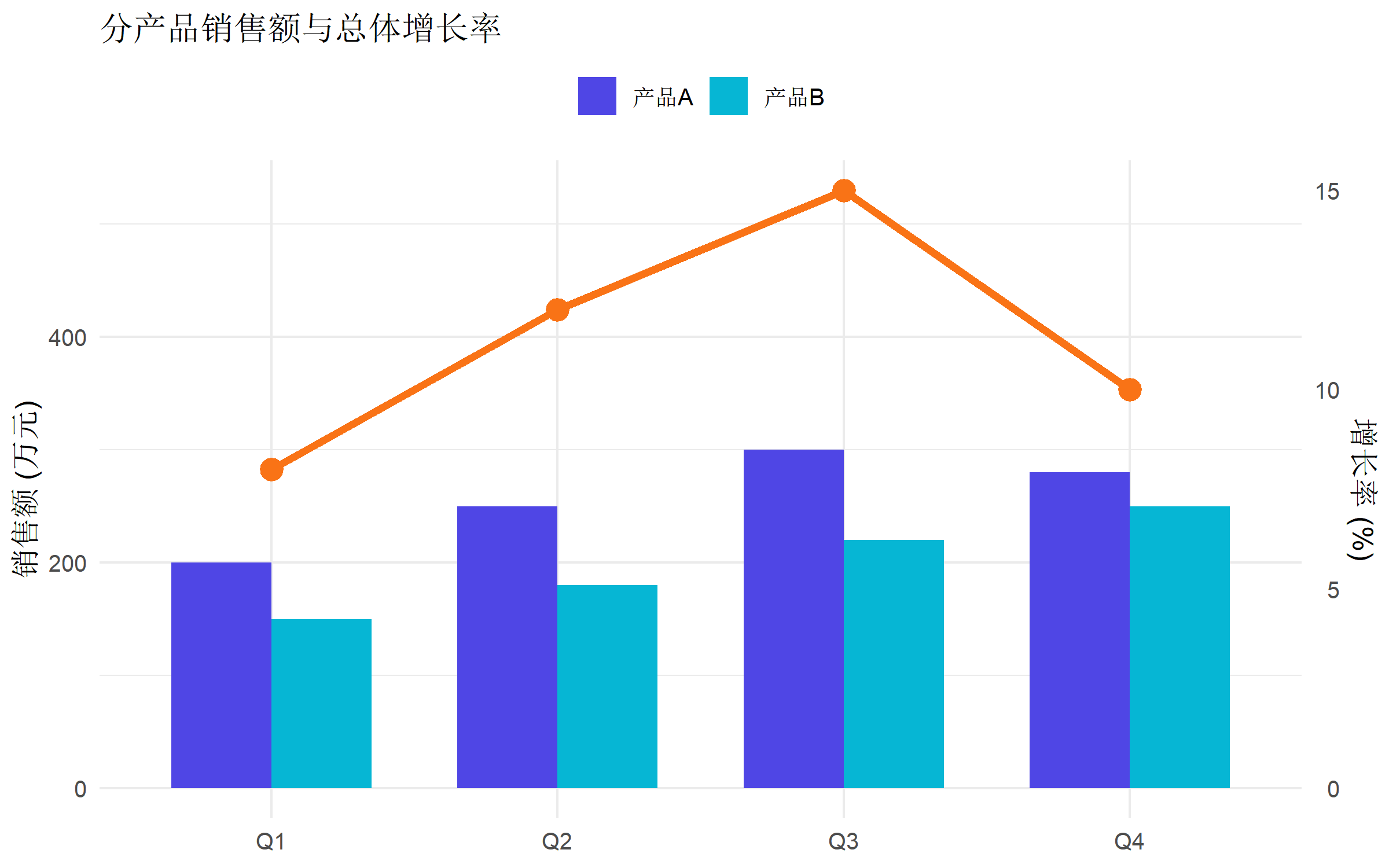
使用 ggnewscale 实现双图例
当需要为两个轴分别设置完整的图例时,可以使用 ggnewscale 包:
library(ggnewscale)

ggplot(df, aes(x = month)) +
  # 第一个图层:柱状图
  geom_col(aes(y = sales, fill = sales), alpha = 0.8) +
  scale_fill_gradient(low = "#c7d2fe", high = "#4f46e5", name = "销售额") +
  # 开启新的填充/颜色标度

  new_scale_color() +
  # 第二个图层:折线图
  geom_line(aes(y = growth_rate * coef, color = growth_rate), linewidth = 1.5) +
  geom_point(aes(y = growth_rate * coef, color = growth_rate), size = 3) +
  scale_color_gradient(low = "#fca5a5", high = "#dc2626", name = "增长率 (%)") +
  scale_y_continuous(
    name = "销售额",
    sec.axis = sec_axis(~ . / coef, name = "增长率 (%)")
  ) +
  scale_x_continuous(breaks = 1:12, labels = paste0(1:12, "月")) +
  labs(title = "月度销售额与增长率", x = NULL) +
  theme_bw(base_size = 12)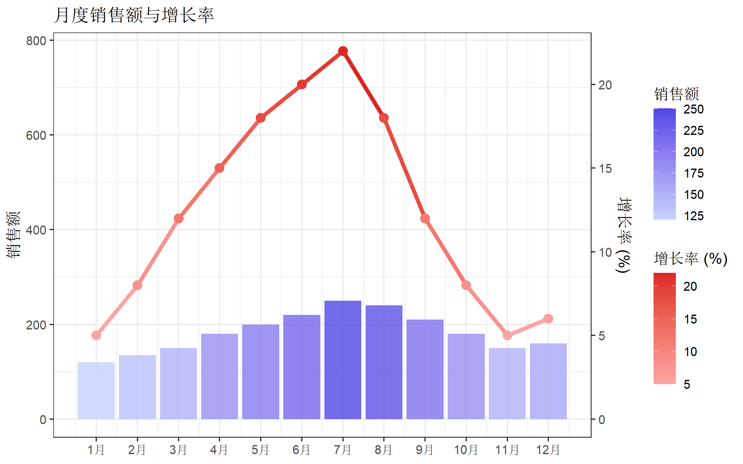
实战案例
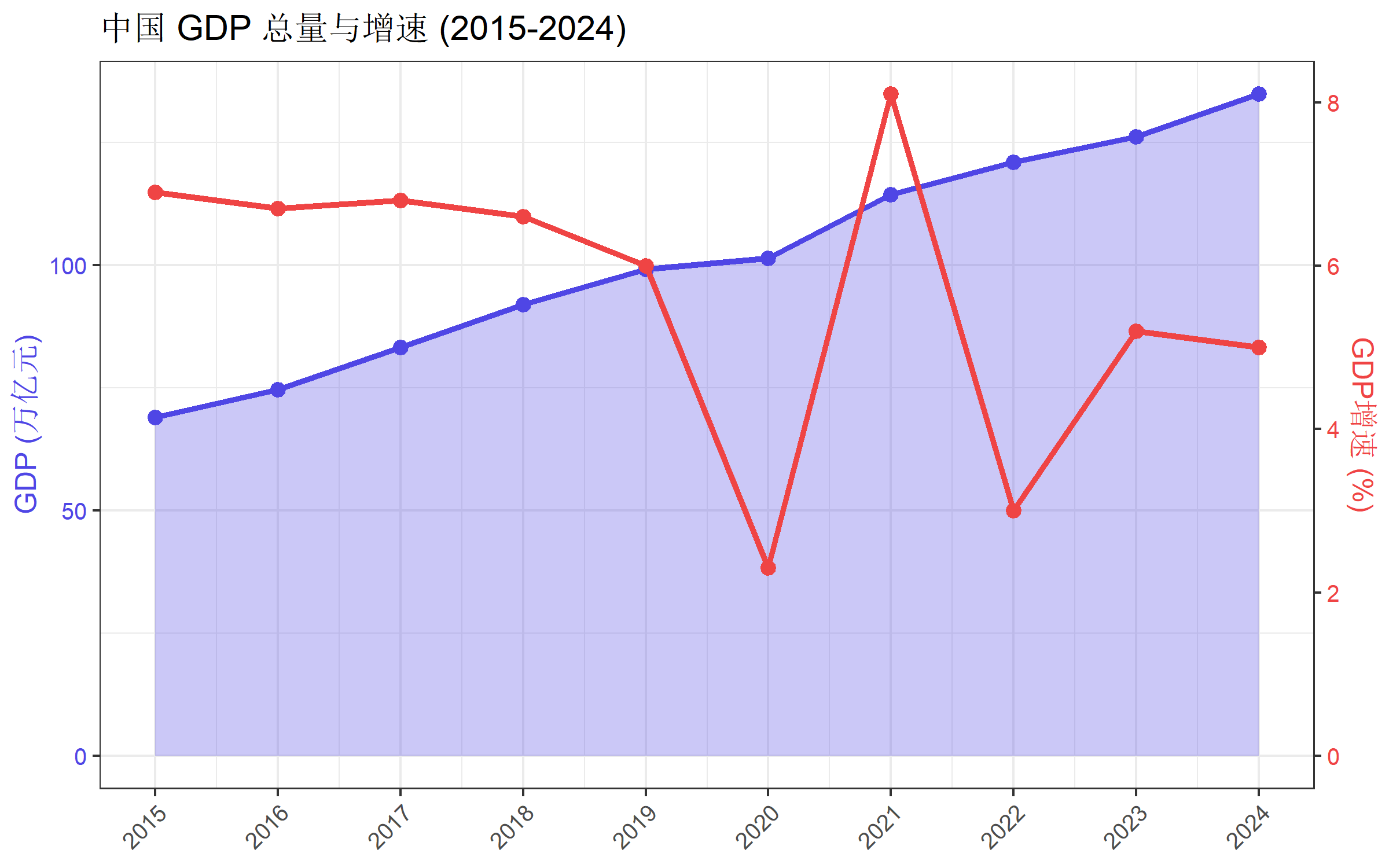
案例1:经济指标对比
# 模拟经济数据
economy <- data.frame(
  year = 2015:2024,
  gdp = c(68.9, 74.6, 83.2, 91.9, 99.1, 101.4, 114.4, 121.0, 126.1, 134.8),
  gdp_growth = c(6.9, 6.7, 6.8, 6.6, 6.0, 2.3, 8.1, 3.0, 5.2, 5.0)
)

coef <- max(economy$gdp) / max(economy$gdp_growth)

ggplot(economy, aes(x = year)) +
  geom_area(aes(y = gdp), fill = "#4f46e5", alpha = 0.3) +
  geom_line(aes(y = gdp), color = "#4f46e5", linewidth = 1.2) +
  geom_point(aes(y = gdp), color = "#4f46e5", size = 2.5) +
  geom_line(aes(y = gdp_growth * coef), color = "#ef4444", linewidth = 1.2) +
  geom_point(aes(y = gdp_growth * coef), color = "#ef4444", size = 2.5) +
  scale_y_continuous(
    name = "GDP (万亿元)",
    sec.axis = sec_axis(~ . / coef, name = "GDP增速 (%)")
  ) +
  scale_x_continuous(breaks = 2015:2024) +
  labs(title = "中国 GDP 总量与增速 (2015-2024)", x = NULL) +
  theme_bw(base_size = 12) +
  theme(
    axis.title.y.left = element_text(color = "#4f46e5"),
    axis.text.y.left = element_text(color = "#4f46e5"),
    axis.title.y.right = element_text(color = "#ef4444"),
    axis.text.y.right = element_text(color = "#ef4444"),
    axis.text.x = element_text(angle = 45, hjust = 1)
  )
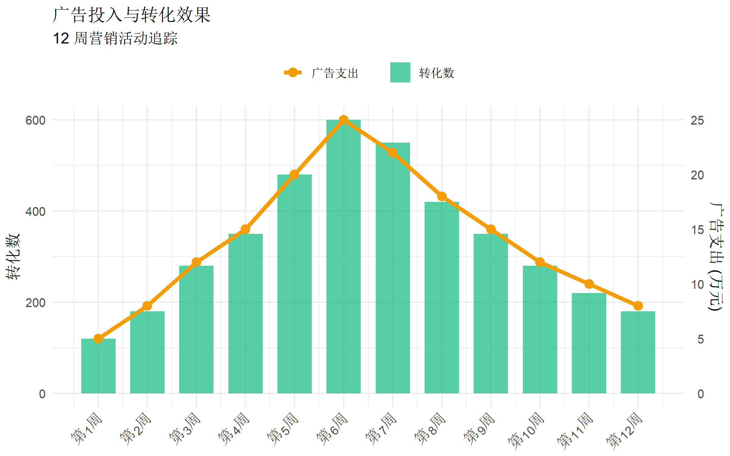
案例2:营销效果分析
# 模拟营销数据
marketing <- data.frame(
  week = 1:12,
  ad_spend = c(5, 8, 12, 15, 20, 25, 22, 18, 15, 12, 10, 8),
  conversions = c(120, 180, 280, 350, 480, 600, 550, 420, 350, 280, 220, 180)
)

coef <- max(marketing$conversions) / max(marketing$ad_spend)

ggplot(marketing, aes(x = week)) +
  geom_col(aes(y = conversions, fill = "转化数"), alpha = 0.7, width = 0.7) +
  geom_line(aes(y = ad_spend * coef, color = "广告支出"), linewidth = 1.5) +
  geom_point(aes(y = ad_spend * coef, color = "广告支出"), size = 3) +
  scale_fill_manual(values = c("转化数" = "#10b981")) +
  scale_color_manual(values = c("广告支出" = "#f59e0b")) +
  scale_y_continuous(
    name = "转化数",
    sec.axis = sec_axis(~ . / coef, name = "广告支出 (万元)")
  ) +
  scale_x_continuous(breaks = 1:12, labels = paste0("第", 1:12, "周")) +
  labs(
    title = "广告投入与转化效果",
    subtitle = "12 周营销活动追踪",
    x = NULL, fill = NULL, color = NULL
  ) +
  theme_minimal(base_size = 12) +
  theme(
    legend.position = "top",
    axis.text.x = element_text(angle = 45, hjust = 1)
  )
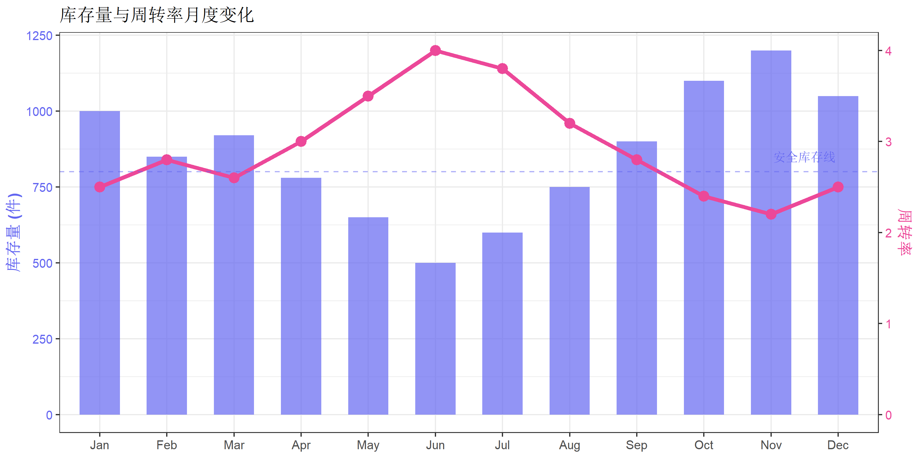
案例3:库存管理
# 模拟库存数据
inventory <- data.frame(
  month = factor(month.abb, levels = month.abb),
  stock = c(1000, 850, 920, 780, 650, 500, 600, 750, 900, 1100, 1200, 1050),
  turnover = c(2.5, 2.8, 2.6, 3.0, 3.5, 4.0, 3.8, 3.2, 2.8, 2.4, 2.2, 2.5)
)

coef <- max(inventory$stock) / max(inventory$turnover)

ggplot(inventory, aes(x = month)) +
  geom_col(aes(y = stock), fill = "#6366f1", alpha = 0.7, width = 0.6) +
  geom_line(aes(y = turnover * coef, group = 1),
            color = "#ec4899", linewidth = 1.5) +
  geom_point(aes(y = turnover * coef), color = "#ec4899", size = 3.5) +
  geom_hline(yintercept = 800, linetype = "dashed", color = "#6366f1", alpha = 0.5) +
  annotate("text", x = 11.5, y = 850, label = "安全库存线",
           color = "#6366f1", size = 3.5) +
  scale_y_continuous(
    name = "库存量 (件)",
    sec.axis = sec_axis(~ . / coef, name = "周转率")
  ) +
  labs(
    title = "库存量与周转率月度变化",
    x = NULL
  ) +
  theme_bw(base_size = 12) +
  theme(
    axis.title.y.left = element_text(color = "#6366f1", face = "bold"),
    axis.text.y.left = element_text(color = "#6366f1"),
    axis.title.y.right = element_text(color = "#ec4899", face = "bold"),
    axis.text.y.right = element_text(color = "#ec4899")
  )
封装函数
为了方便复用,可以将双坐标轴绑图封装成函数:
#' 创建柱线混合双坐标轴图
#'
#' @param data 数据框
#' @param x x轴变量名(字符串)
#' @param y1 主轴变量名(柱状图)
#' @param y2 次轴变量名(折线图)
#' @param y1_name 主轴标签
#' @param y2_name 次轴标签
#' @param title 图表标题
#' @param bar_color 柱状图颜色
#' @param line_color 折线图颜色
create_dual_axis_plot <- function(
data, x, y1, y2,
y1_name = y1, y2_name = y2,
title = NULL,
bar_color = "#4f46e5",
line_color = "#ef4444"
) {
# 提取数据
x_val <- data[[x]]
y1_val <- data[[y1]]
y2_val <- data[[y2]]
# 计算转换系数
coef <- max(y1_val, na.rm = TRUE) / max(y2_val, na.rm = TRUE)
# 创建绑图数据
plot_data <- data.frame(
x = x_val,
y1 = y1_val,
y2 = y2_val,
y2_scaled = y2_val * coef
)
# 绘图
ggplot(plot_data, aes(x = x)) +
geom_col(aes(y = y1), fill = bar_color, alpha = 0.7, width = 0.6) +
geom_line(aes(y = y2_scaled, group = 1), color = line_color, linewidth = 1.2) +
geom_point(aes(y = y2_scaled), color = line_color, size = 3) +
scale_y_continuous(
name = y1_name,
sec.axis = sec_axis(~ . / coef, name = y2_name)
) +
labs(title = title, x = NULL) +
theme_bw(base_size = 12) +
theme(
axis.title.y.left = element_text(color = bar_color, face = "bold"),
axis.text.y.left = element_text(color = bar_color),
axis.title.y.right = element_text(color = line_color, face = "bold"),
axis.text.y.right = element_text(color = line_color)
)
}
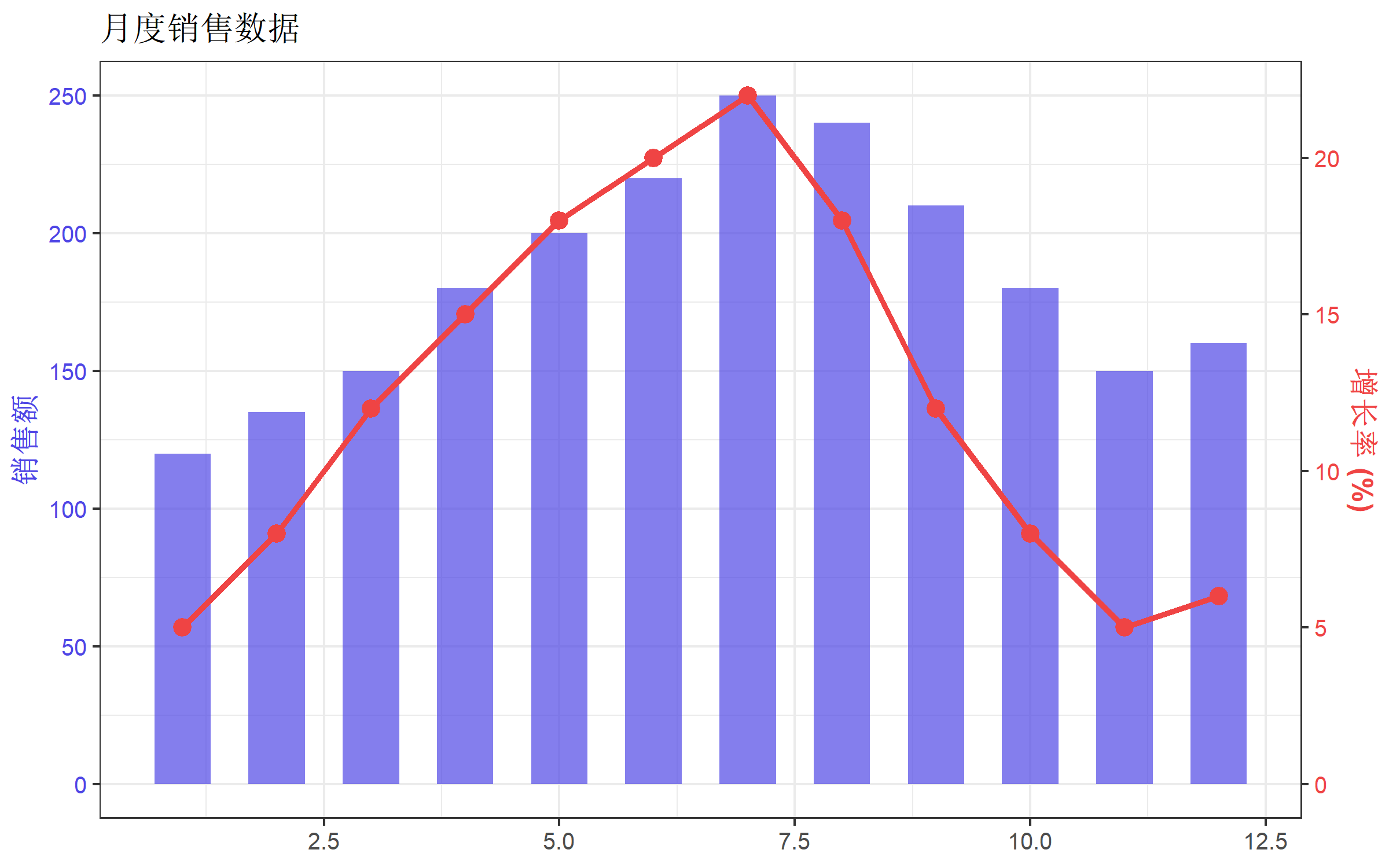
# 使用示例
create_dual_axis_plot(
data = df,
x = "month",
y1 = "sales",
y2 = "growth_rate",
y1_name = "销售额",
y2_name = "增长率 (%)",
title = "月度销售数据"
)
常见问题
1. 如何确定合适的转换系数?
最常用的方法是让两个变量的最大值对齐:
coef <- max(主轴变量) / max(次轴变量)也可以根据数据范围调整:
# 让两个变量的范围对齐
coef <- diff(range(主轴变量)) / diff(range(次轴变量))
2. 次轴数据显示不完整怎么办?
调整主轴的 limits:
scale_y_continuous(
  limits = c(0, max(主轴变量) * 1.1),  # 留出10%空间
  sec.axis = sec_axis(...)
)
3. 如何让次轴从 0 开始?
需要对数据进行偏移变换:
# 示例:次轴数据范围是 10-30,想让它从 0 开始显示
df_offset <- data.frame(
  x = 1:5,
  y1 = c(100, 150, 200, 180, 220),
  y2 = c(10, 15, 20, 25, 30)
)

# 计算偏移和缩放
y2_min <- min(df_offset$y2)
y2_max <- max(df_offset$y2)
y1_max <- max(df_offset$y1)

# 变换公式: y2_transformed = (y2 - y2_min) * y1_max / (y2_max - y2_min)
coef <- y1_max / (y2_max - y2_min)
offset <- y2_min

ggplot(df_offset, aes(x = x)) +
  geom_col(aes(y = y1), fill = "#4f46e5", alpha = 0.7) +
  geom_line(aes(y = (y2 - offset) * coef), color = "#ef4444", linewidth = 1.2) +
  scale_y_continuous(
    name = "主轴",
    sec.axis = sec_axis(~ . / coef + offset, name = "次轴")
  ) +
  theme_bw()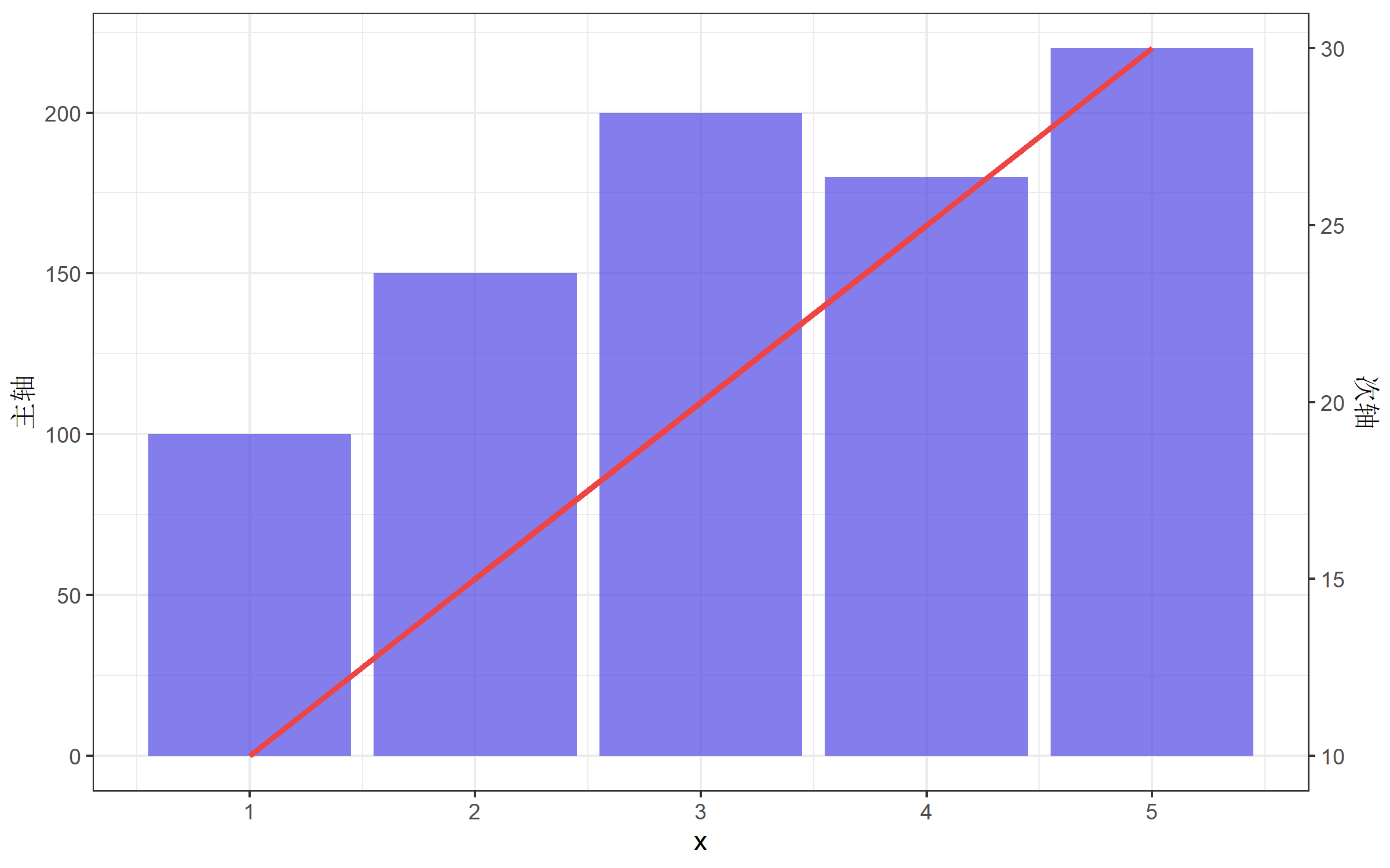
4. 双坐标轴 vs 分面图
当不确定是否使用双坐标轴时,考虑用分面图替代:
# 数据转换为长格式
df_long <- df |>
  pivot_longer(cols = c(sales, growth_rate),
               names_to = "metric",
               values_to = "value") |>
  mutate(metric = ifelse(metric == "sales", "销售额", "增长率 (%)"))

# 分面图
ggplot(df_long, aes(x = month, y = value, color = metric)) +
  geom_line(linewidth = 1.2) +
  geom_point(size = 2.5) +
  facet_wrap(~ metric, ncol = 1, scales = "free_y") +
  scale_x_continuous(breaks = 1:12, labels = paste0(1:12, "月")) +
  labs(title = "月度销售数据", x = NULL, y = NULL, color = NULL) +
  theme_bw(base_size = 12) +
  theme(legend.position = "none")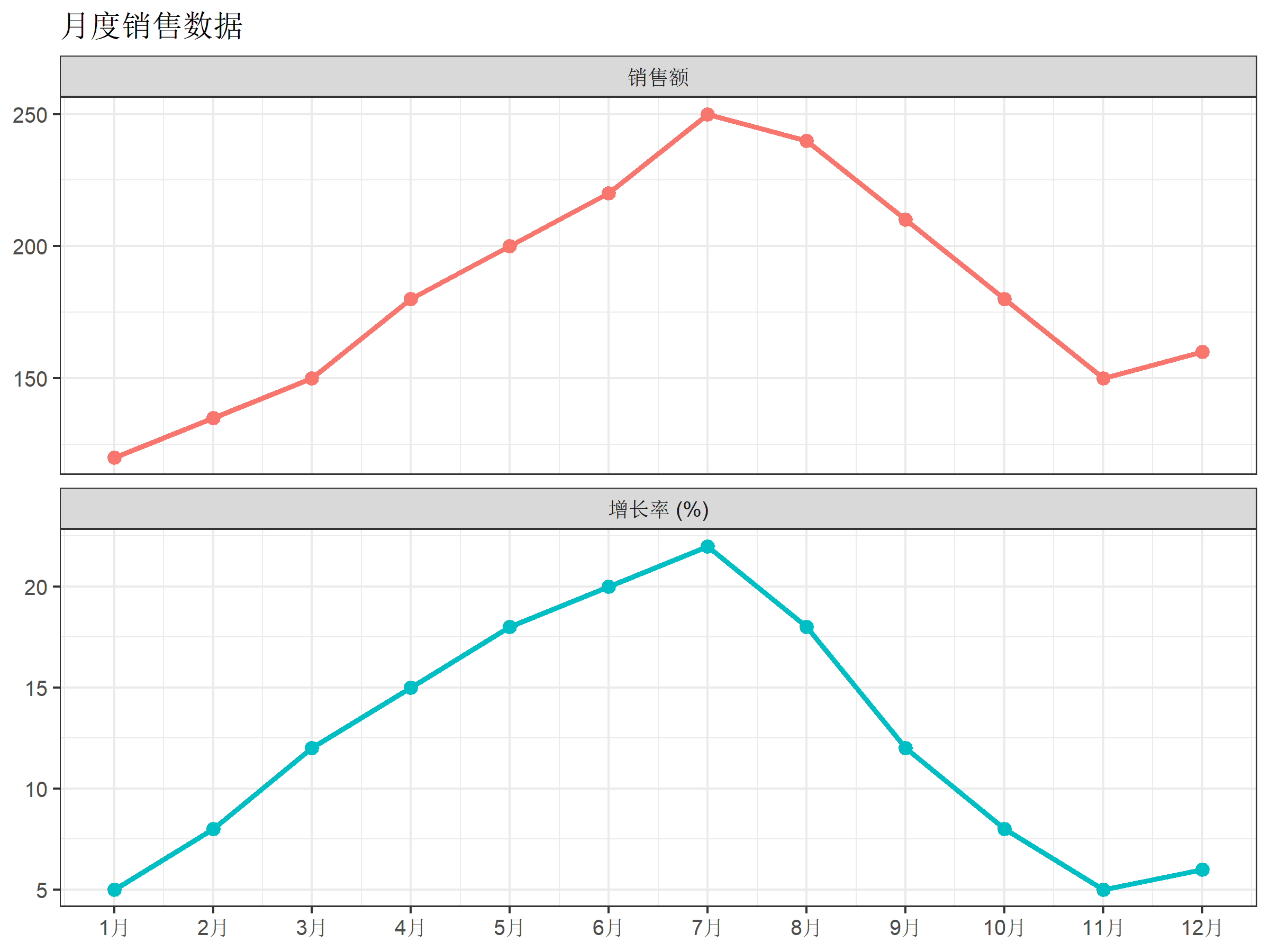
总结
双坐标轴的核心要点:
- 原理:次轴是主轴的线性变换,通过
sec_axis()实现 - 转换系数:
coef = max(主轴) / max(次轴) - 绘制次轴数据:乘以系数
y2 * coef - 设置次轴刻度:除以系数
~ . / coef - 美化:匹配坐标轴颜色,添加图例
使用建议:
- ✅ 两个变量有明确关联时使用
- ✅ 用颜色区分两个轴
- ✅ 清晰标注单位
- ❌ 避免刻意调整比例误导读者
- ❌ 当数据复杂时,考虑分面图替代
参考资源
- ggplot2 官方文档 - sec_axis
- ggnewscale 包
- Why not to use two Y axes - 关于双坐标轴争议的讨论